





A modern and interactive custom card to display your entities as linear gauges. Enjoy a premium design, smooth animations, and high display flexibility.
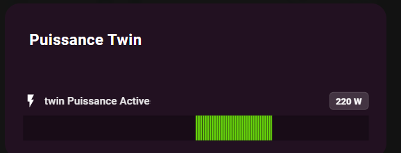
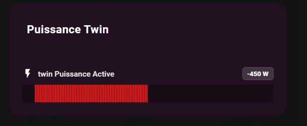
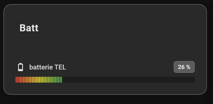

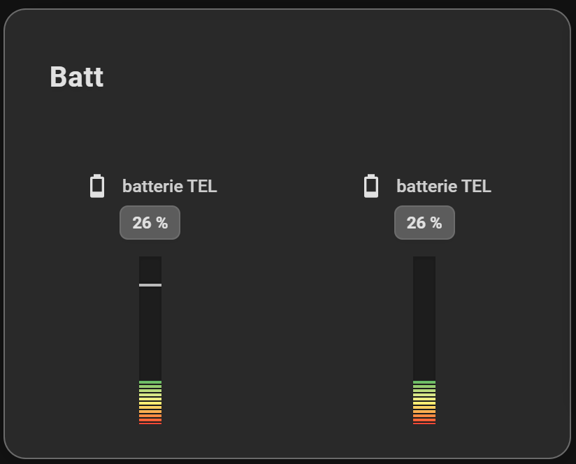
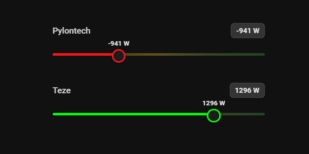
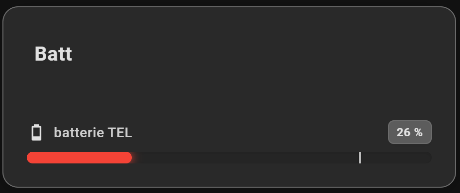
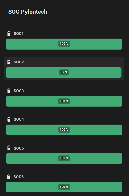
- Visual Editor: Fully configurable via the Home Assistant UI.
- Theme Integration: Follows your Home Assistant theme or custom background color with transparency support.
- Interactive Actions: Full support for
tap_actionon each entity (toggle, navigation, call-service, URL). - Icons: Material Design icons support.
- Targets: Display a target marker, either a fixed value (
target) or driven by an entity's state (target_entity). - Visual Alerts: Pulse animation that blinks the bar for critical states.
- 24h Min/Max: Visualization of the value range over the last 24 hours.
- Flexible Layout: Choose between horizontal (list) or vertical (columns) display.
- Smart Gradients: Define a global gradient or specific colors per entity.
- LED Effect: Segmented and rectangular display mode for a modern "pixel" style.
- Gauge Styles: Choose how each gauge is drawn —
bar,gradient_track,segments(LED, adjustable count),ticks(adjustable graduations),cursor(selectable shapes) orsparkline(24h trend). - Compact Mode: Minimal display with just icon and bar to save space.
- Value in Bar: Display the value directly on the progress bar (hides the value next to the name to avoid duplication).
- Shimmer Effect: Animated shine effect on bars (can be disabled).


- Open HACS in Home Assistant
- Go to "Frontend"
- Click on the menu (⋮) in the top right
- Select "Custom repositories"
- Add the URL:
https://github.com/guiohm79/jaugeLineaire - Select category "Lovelace"
- Click "Install"
- Restart Home Assistant
- Download the
linear-gauge-card.jsfile - Copy it to
config/www/linear-gauge-card.js - Add the resource in Home Assistant:
- Go to Settings → Dashboards → Resources
- Click + Add Resource
- URL:
/local/linear-gauge-card.js - Type: JavaScript Module
- Restart Home Assistant
The card can be configured entirely via the Visual Editor.
Type: custom:linear-gauge-card
| Option | Type | Description |
|---|---|---|
title |
string | Card title |
entities |
list | List of entities to display (required) |
layout |
string | horizontal (default) or vertical |
min |
number | Global minimum value (default: 0) |
max |
number | Global maximum value (default: 100) |
show_min_max |
boolean | Show 24h min/max markers (default: false) |
colors |
list | List of colors for a global gradient |
color |
string | Global fixed color (overrides gradient) |
color_negative |
string | Global fixed color for negative values when center_zero is active |
severity |
list | Global severity configuration |
effect |
string | default or led for a rectangular segmented effect (legacy — prefer gauge_style) |
gauge_style |
string | How the gauge is drawn: bar (default), gradient_track, segments, ticks, cursor, sparkline |
segment_count |
number | Number of LEDs/segments for the segments style (default: 20, range 3–120) |
tick_count |
number | Number of labelled graduations for the ticks style (default: 5, min 2) |
cursor_shape |
string | Thumb shape for the cursor style: circle (default), line, arrow, diamond, bar |
tap_action |
object | Default action on click (e.g., toggle) |
transparent |
boolean | Transparent background (default: false) |
card_background |
string | Custom card background color (with alpha support) |
compact_mode |
boolean | Compact display mode (default: false) |
show_value_in_bar |
boolean | Show value inside the bar, hides value next to name (default: false) |
disable_shimmer |
boolean | Disable the shimmer animation effect (default: false) |
center_zero |
boolean | Start the bar at the zero point. Negative values extend left/bottom, positive extend right/top (default: false) |
bar_thickness |
number | Bar thickness in pixels (default: 12) |
vertical_height |
number | Vertical bar height in pixels (default: 120) |
vertical_width |
number | Vertical bar width in pixels (default: 16) |
Each entity in the list can be configured individually:
| Option | Type | Description |
|---|---|---|
entity |
string | Entity ID (e.g., sensor.cpu_load) |
name |
string | Custom displayed name |
icon |
string | Icon (e.g., mdi:thermometer) |
target |
number | Fixed target marker value |
target_entity |
string | Entity whose state drives the target marker (takes priority over target) |
min / max |
number | Specific limits for this entity |
color |
string | Fixed color for this gauge (overrides global) |
color_negative |
string | Fixed color for negative values when center_zero is active |
severity |
list | Specific color thresholds |
effect |
string | Effect override (default or led) |
gauge_style |
string | Per-entity gauge style override (see global gauge_style) |
segment_count |
number | Per-entity LED/segment count override |
tick_count |
number | Number of labelled graduations for the ticks style (default 5, min 2) |
cursor_shape |
string | Thumb shape for the cursor style: circle (default), line, arrow, diamond, bar |
pulse |
object | Pulse alert configuration (see below) |
tap_action |
object | Specific action on click |
compact_mode |
boolean | Compact mode for this entity |
show_value_in_bar |
boolean | Show value in bar for this entity |
disable_shimmer |
boolean | Disable shimmer for this entity |
center_zero |
boolean | Center zero mode for this entity |
Define color thresholds based on value ranges:
severity:
  - from: 0
    color: "#4caf50"    # Green
  - from: 50
    color: "#ffeb3b"    # Yellow
  - from: 80
    color: "#f44336"    # Red
pulse: true # Enable pulse animationAllows triggering an animation if a value exceeds a threshold:
pulse:
  value: 80           # Threshold value
  condition: above    # 'above' (>=) or 'below' (<=)
Pulse can also be activated via severity with pulse: true.
Standard Home Assistant configuration:
tap_action:
  action: toggle              # or more-info, call-service, navigate, url, none
  # for navigate:
  navigation_path: /lovelace/0
  # for url:
  url_path: https://example.com
  # for call-service:
  service: light.turn_on
  data:
    brightness: 255
The action always targets the gauge's own entity.
A marker can be drawn on the gauge, either at a fixed value or driven by an entity:
- entity: sensor.temperature
  target: 80                        # Fixed marker at 80
target_entity: sensor.target_temp # Dynamic marker (takes priority over target)type: custom:linear-gauge-card
title: Server
show_min_max: true
colors:
- "#4caf50"
- "#ffeb3b"
- "#f44336"
entities:
- entity: sensor.cpu_load
name: CPU
icon: mdi:cpu-64-bit
target: 80 # Marker at 80%
severity:
- from: 90
color: "#d32f2f"
pulse: true # Activates pulse animation
- entity: sensor.temperature
icon: mdi:thermometer
target_entity: sensor.target_temp # Dynamic marker
tap_action:
action: toggletype: custom:linear-gauge-card
title: Battery
gauge_style: segments
segment_count: 24 # number of LEDs (3–120)
entities:
- entity: sensor.battery_level
name: Level
effect: ledstill works and is treated asgauge_style: segments.
Set gauge_style globally or per entity. Available values:
| Value | Description |
|---|---|
bar |
Classic filled bar (default) |
gradient_track |
Full colour scale shown faintly in the track, crisp fill on top |
segments |
LED/segment style — number of segments set with segment_count |
ticks |
Instrument-style bar with numbered graduations and a labelled target. Set the number of graduations with tick_count; enable show_value_in_bar to show the current value above the fill |
cursor |
Thin gradient track with a slider-like cursor — great for dense dashboards. Pick the thumb shape with cursor_shape (circle, line, arrow, diamond, bar) |
sparkline |
24h trend line (requires history; falls back to a bar until data loads) |
type: custom:linear-gauge-card
title: Server
gauge_style: gradient_track
entities:
  - entity: sensor.cpu_load
    name: CPU
    target: 85
  - entity: sensor.temperature
    name: Temp
gauge_style: sparkline # per-entity overridetype: custom:linear-gauge-card
title: Resources
layout: vertical
entities:
- entity: sensor.cpu_load
name: CPU
- entity: sensor.memory_usage
name: RAM
- entity: sensor.disk_use_percent
name: Disktype: custom:linear-gauge-card
title: Battery Levels
compact_mode: true
show_value_in_bar: true
colors:
- "#f44336"
- "#ffeb3b"
- "#4caf50"
entities:
- entity: sensor.battery_1
icon: mdi:battery
- entity: sensor.battery_2
icon: mdi:battery
- entity: sensor.battery_3
icon: mdi:battery
compact_mode: false # Override: show full for this entitytype: custom:linear-gauge-card
title: Clean Look
disable_shimmer: true # Disable shimmer globally
entities:
- entity: sensor.cpu_load
name: CPU
icon: mdi:cpu-64-bit
- entity: sensor.memory_usage
name: RAM
icon: mdi:memory
disable_shimmer: false # Re-enable for this entitytype: custom:linear-gauge-card
title: Temperature
card_background: "rgba(255, 0, 0, 0.2)" # Semi-transparent red
entities:
- entity: sensor.living_room_temp
icon: mdi:thermometertype: custom:linear-gauge-card
title: Energy Monitor
color: "#03a9f4" # Global fixed blue color
entities:
- entity: sensor.solar_power
name: Solar
icon: mdi:solar-power
max: 5000
color: "#ffeb3b" # Yellow for solar
- entity: sensor.house_power
name: House
icon: mdi:home-lightning-bolt
max: 5000
- entity: sensor.grid_power
name: Grid
icon: mdi:transmission-tower
max: 5000
severity:
- from: 0
color: "#4caf50" # Green when consuming
- from: 1000
color: "#f44336" # Red when high consumptionWhen multiple color options are defined, the following priority order is used:
- Entity severity (highest priority)
- Entity fixed color (
color) - Global severity (
severity) - Global fixed color (
color) - Global gradient (
colors) - Default theme color (fallback)
See CHANGELOG.md for the full history. Latest: v1.2.0 — six gauge styles, dynamic target marker, blinking pulse, and editor fixes.
If you encounter any issues or have feature requests, please open an issue on GitHub.
If you find this card useful, consider buying me a coffee! ☕