feat(nav): link Catalogs from the side menu (chat#1912 row 3) - #1913
Conversation


The app's only navigation listed Agents / Tasks / Files, so Catalogs — the
valuation payoff surface and the funnel's conversion target — was reachable
only by direct URL or its own back-link.

Adds CatalogsNavItem and renders it in both nav surfaces: SecondaryNav
(desktop rail, via Menu) and SideMenu (mobile), each with the pathname-derived
active state the sibling items already use.

Reported by a live customer 2026-07-29: "I'm not sure where to find the
tooling in the site ... I guess I'm waiting on the newsletter."

Co-Authored-By: Claude Opus 5 (1M context) <noreply@anthropic.com>

|
Bugbot is not enabled for your account, so this pull request was not reviewed. Enable Bugbot in the Cursor dashboard to get automatic reviews on future PRs. |

|
The latest updates on your projects. Learn more about Vercel for GitHub.
|



|
Warning Review limit reached
Next review available in: 48 minutes Enable usage-based reviews in Billing to review now. Otherwise, wait until the next included review is available. How can I continue?After more reviews become available, a review can be triggered using the To avoid repeated limits, reduce automatic review volume by pausing incremental auto-reviews earlier, using label-based review opt-in, excluding WIP or generated PR titles, or requesting reviews manually when the PR is ready. If your team needs uninterrupted high-volume reviews, an organization admin can enable usage-based reviews. How do review limits work?CodeRabbit enforces per-developer PR review limits for each organization. Most developers receive the normal plan review availability. For paid Pro and Pro+ PR reviews, CodeRabbit uses adaptive limits for sustained high-volume activity. When a developer's recent PR review activity reaches the 95th percentile or higher among CodeRabbit users, additional reviews become available more gradually as earlier reviews age out of the rolling window. Please refer docs for additional details. Review details⚙️ Run configurationConfiguration used: Path: .coderabbit.yaml Review profile: CHILL Plan: Pro Plus Run ID: 📒 Files selected for processing (2)
📝 WalkthroughWalkthroughAdds a Catalogs navigation item to both sidebar navigation paths, with route-based active state, a book icon, accessibility labeling, and navigation through the existing ChangesCatalogs navigation
Estimated code review effort: 2 (Simple) | ~10 minutes Poem
🚥 Pre-merge checks | ✅ 3✅ Passed checks (3 passed)
✨ Finishing Touches📝 Generate docstrings
🧪 Generate unit tests (beta)
Thanks for using CodeRabbit! It's free for OSS, and your support helps us grow. If you like it, consider giving us a shout-out. Comment |


![coderabbitai[bot]](https://avatars.githubusercontent.com/in/347564?s=60&v=4)

There was a problem hiding this comment.
Actionable comments posted: 1
🤖 Prompt for all review comments with AI agents
Verify each finding against current code. Fix only still-valid issues, skip the
rest with a brief reason, keep changes minimal, and validate.

Inline comments:
In `@components/Sidebar/CatalogsNavItem.tsx`:
- Around line 3-11: Replace the anonymous inline props type on CatalogsNavItem
with a named CatalogsNavItemProps interface, preserving the existing isActive,
optional isExpanded, and onClick definitions, and use that interface in the
component declaration.
🪄 Autofix (Beta)
Fix all unresolved CodeRabbit comments on this PR:
- Push a commit to this branch (recommended)
- Create a new PR with the fixes
ℹ️ Review info
⚙️ Run configuration
Configuration used: Path: .coderabbit.yaml
Review profile: CHILL
Plan: Pro Plus
Run ID: 58586a13-e3fd-497f-b575-f93fcf1002f2
⛔ Files ignored due to path filters (1)
components/Sidebar/__tests__/SecondaryNav.test.tsxis excluded by!**/*.test.*and included bycomponents/**
📒 Files selected for processing (4)
components/SideMenu/SideMenu.tsxcomponents/Sidebar/CatalogsNavItem.tsxcomponents/Sidebar/Menu.tsxcomponents/Sidebar/SecondaryNav.tsx
![chatgpt-codex-connector[bot]](https://avatars.githubusercontent.com/in/1144995?s=60&v=4)

There was a problem hiding this comment.
💡 Codex Review
Here are some automated review suggestions for this pull request.
Reviewed commit: e8eeb6002c
ℹ️ About Codex in GitHub
Codex has been enabled to automatically review pull requests in this repo. Reviews are triggered when you
- Open a pull request for review
- Mark a draft as ready
- Comment "@codex review".
If Codex has suggestions, it will comment; otherwise it will react with 👍.
When you sign up for Codex through ChatGPT, Codex can also answer questions or update the PR, like "@codex address that feedback".
| }) => { | ||
| return ( | ||
| <NavButton | ||
| icon="book" |
There was a problem hiding this comment.

In dark theme, this new nav entry is rendered on bg-sidebar/bg-card backgrounds while the resolver's book SVG hard-codes its path to fill="black"; unlike the existing nav icons, NavButton's text-foreground cannot recolor it. Users with system dark mode will get a black Catalogs icon on a near-black sidebar, especially in the collapsed desktop rail where the label is hidden, so the new navigation target is effectively invisible; use a currentColor icon or update the book SVG before using it here.
AGENTS.md reference: AGENTS.md:L74-L78
Useful? React with 👍 / 👎.
| // Ben Hanchett, 2026-07-29: "I'm not sure where to find the tooling in the | ||
| // site ... I guess I'm waiting on the newsletter." Catalogs is the valuation |
There was a problem hiding this comment.
This test comment commits a real customer's full name plus their quoted feedback into source control. Even though it is only test code, it exposes customer identity/context to everyone with repo access and any downstream code artifacts; keep the regression rationale anonymized or reference the issue without personally identifying details.
Useful? React with 👍 / 👎.
![cubic-dev-ai[bot]](https://avatars.githubusercontent.com/in/1082092?s=60&v=4)

There was a problem hiding this comment.
No issues found across 5 files
Confidence score: 5/5
- Automated review surfaced no issues in the provided summaries.
- No files require special attention.
Auto-approved: Adds a navigation link to the existing Catalogs page, mirroring the pattern used by other nav items. No new functionality, schema changes, or tradeoffs; bounded UI change with tests.
Re-trigger cubic
… tests

Three review findings, all validated first:

- codex P2: the book icon's path hard-coded fill="black" while every sibling
  nav icon uses stroke="currentColor", so Catalogs rendered black on the dark
  sidebar. NavButton's text-foreground cannot recolor a hard-coded fill. The
  icon has no other consumer, so switching it to currentColor is contained.
- coderabbit: named CatalogsNavItemProps interface, per the repo's own
  .coderabbit.yaml guideline ("Use TypeScript interfaces for props").
- codex P2: dropped a customer's real name and quoted feedback from a test
  comment; the reporter and quote belong on chat#1912, not in source.

Co-Authored-By: Claude Opus 5 (1M context) <noreply@anthropic.com>
There was a problem hiding this comment.
0 issues found across 3 files (changes from recent commits).
Confidence score: 5/5
- Automated review surfaced no issues in the provided summaries.
- No files require special attention.
Auto-approved: Adds a navigation link to an existing Catalogs page, fixing a discoverability issue. No backend, schema, security, or operational changes; implementation is bounded and clearly beneficial.
Re-trigger cubic
Review (@sweetmantech): a book reads as reading material; a disc reads as
recordings, which is what a catalog is.

Adds a `disc` entry to the icon resolver, inlined from lucide's Disc3 in the
same style as the neighbouring files and clock icons. It ships
stroke="currentColor", so it inherits NavButton's text-foreground and is
theme-aware by construction — which also resolves the codex finding about the
book glyph's hard-coded fill="black" without touching an icon this PR no
longer uses.

Co-Authored-By: Claude Opus 5 (1M context) <noreply@anthropic.com>

Preview verification — 2026-07-30Two preview builds were used, because the icon changed mid-review. Each row below says which commit it ran against.
Both deployments were resolved by sha, not by branch. Results
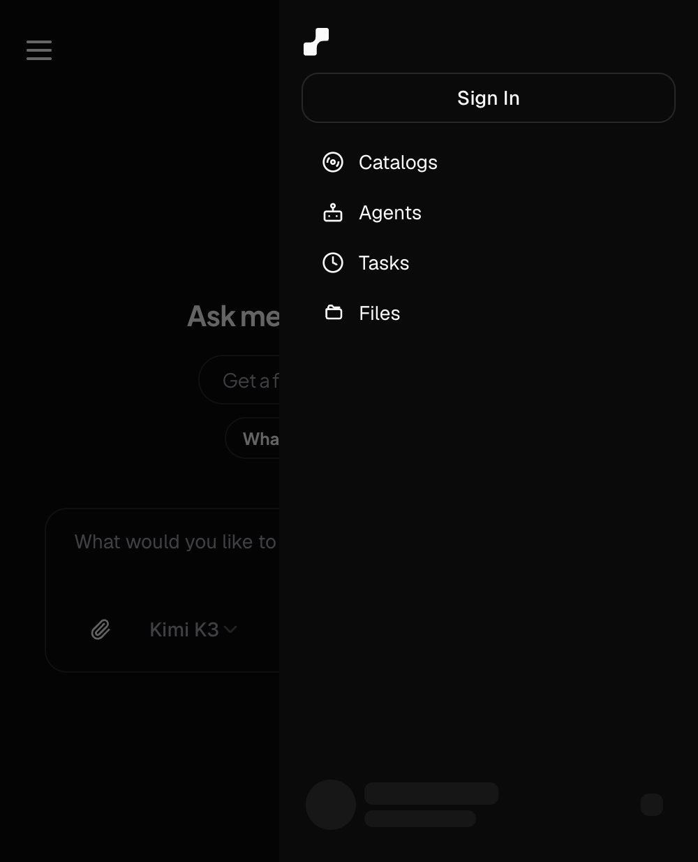
Row 3 ran on Screenshots390px — Catalogs leads the tool list, disc icon:
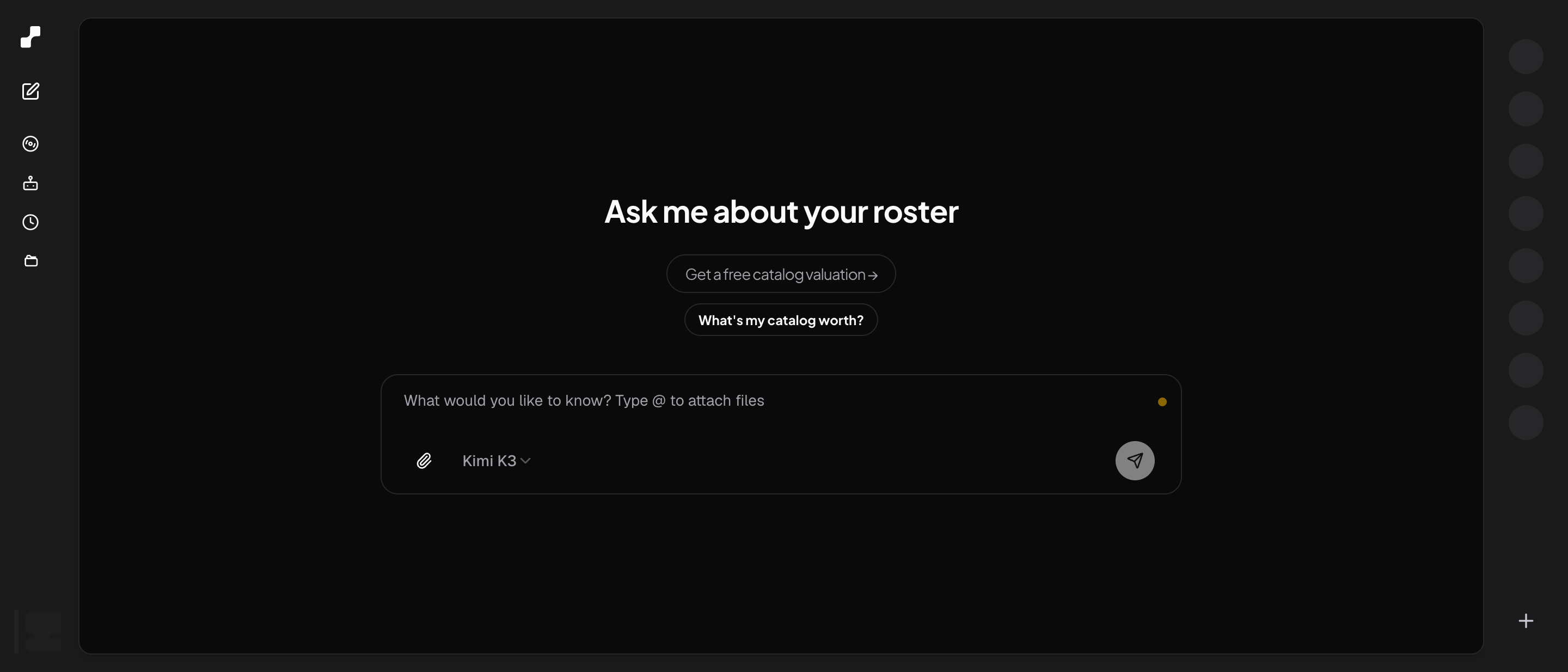
1440px:
Review findingsAll three validated against the code before acting.
Note for mergeThis branch predates chat#1914, so its preview still shows the old Suite 285 passed / 76 files, |
There was a problem hiding this comment.
1 issue found across 2 files (changes from recent commits).
Confidence score: 4/5
- In
components/Sidebar/CatalogsNavItem.tsx, the implementedicon="disc"conflicts with the PR description claiming abookicon, which creates a concrete spec-to-code mismatch that can cause UI inconsistency and reviewer confusion about intended behavior — align either the code or the PR documentation so they match before merge.
Prompt for AI agents (unresolved issues)
Check if these issues are valid — if so, understand the root cause of each and fix them. If appropriate, use sub-agents to investigate and fix each issue separately.


<file name="components/Sidebar/CatalogsNavItem.tsx">

<violation number="1" location="components/Sidebar/CatalogsNavItem.tsx:16">
P2: Custom agent: **Flag AI Slop and Fabricated Changes**

The PR description explicitly states CatalogsNavItem uses a `book` icon, but the implementation uses `icon="disc"`. This is a clear mismatch between the documented behavior and the actual code. Please align the icon choice with the PR description, or update the description to reflect the chosen `disc` icon.</violation>
</file>
Tip: Review your code locally with the cubic CLI to iterate faster.
Re-trigger cubic
| }: CatalogsNavItemProps) => { | ||
| return ( | ||
| <NavButton | ||
| icon="disc" |
There was a problem hiding this comment.
P2: Custom agent: Flag AI Slop and Fabricated Changes
The PR description explicitly states CatalogsNavItem uses a book icon, but the implementation uses icon="disc". This is a clear mismatch between the documented behavior and the actual code. Please align the icon choice with the PR description, or update the description to reflect the chosen disc icon.
Prompt for AI agents
Check if this issue is valid — if so, understand the root cause and fix it. At components/Sidebar/CatalogsNavItem.tsx, line 16:

<comment>The PR description explicitly states CatalogsNavItem uses a `book` icon, but the implementation uses `icon="disc"`. This is a clear mismatch between the documented behavior and the actual code. Please align the icon choice with the PR description, or update the description to reflect the chosen `disc` icon.</comment>

<file context>
@@ -13,7 +13,7 @@ const CatalogsNavItem = ({
   return (
     <NavButton
-      icon="book"
+      icon="disc"
       label="Catalogs"
       isActive={isActive}
</file context>

Dismissed because Cubic found issues in a newer review.

1 participant

Closes row 3 of chat#1912.
Why
The app's only navigation lists exactly Agents / Tasks / Files. Catalogs — the valuation payoff surface, and the conversion target of the whole funnel — is unreachable from the menu; the catalog page is enterable only via direct URL or its own back-link.
Reported by a live outreach customer on 2026-07-29 (account
148e1644):Confirmed on prod 2026-07-30 at both breakpoints — 390px showed only New Chat / Agents / Tasks / Files, and the 1440px rail was four unlabeled icons. Screenshots in the issue.
What changed
components/Sidebar/CatalogsNavItem.tsx, mirroringFilesNavItemexactly (sameNavButton,bookicon from the existing resolver,aria-label="View catalogs"). No new dependency, no new icon asset.SecondaryNavtakesisCatalogsand renders the item first in the tool list — Catalogs is the payoff surface, so it leads.Menu(desktop rail) andSideMenu(mobile).Catalogs leads the list rather than being appended, because the whole point of the report is that a customer arrives wanting the number.
Tests
components/Sidebar/__tests__/SecondaryNav.test.tsx— new, TDD red→green:Unable to find an accessible element with the role "button" and name /view catalogs/i)catalogs(same RED)Full suite 285 passed / 76 files,
tsc --noEmitclean.Verification
Preview verification against the issue's Works when script (390px + 1440px, navigational only, no pasted URLs) will be posted as a PR comment once the preview builds.
🤖 Generated with Claude Code
Summary by cubic
Adds Catalogs to the sidebar and mobile side menu, placed first in the tools list so users can open catalogs directly from navigation. Addresses chat#1912 row 3 by making catalogs discoverable.
New Features
NavButtonwith the "disc" icon and aria-label "View catalogs".Bug Fixes
currentColorby addingdisctoIcon/resolver.CatalogsNavItemPropsinterface and removed customer-identifying text from tests.Written for commit a934e11. Summary will update on new commits.
Summary by CodeRabbit
currentColor, improving consistency with the surrounding text/theme.