


I like questions everyone already thinks they know the answer to. This is the first one I took apart properly.
Everyone knows television declines: shows arrive full of promise, spend their best ideas early, and coast downhill to a finish nobody asked for. I tested that against 192,720 episode ratings from 3,234 series.
It's mostly false. Only about one in six shows clearly declines, the largest group barely moves at all, and more shows rise than fall. The moment the belief expects a collapse — the finale — is usually a show's peak.
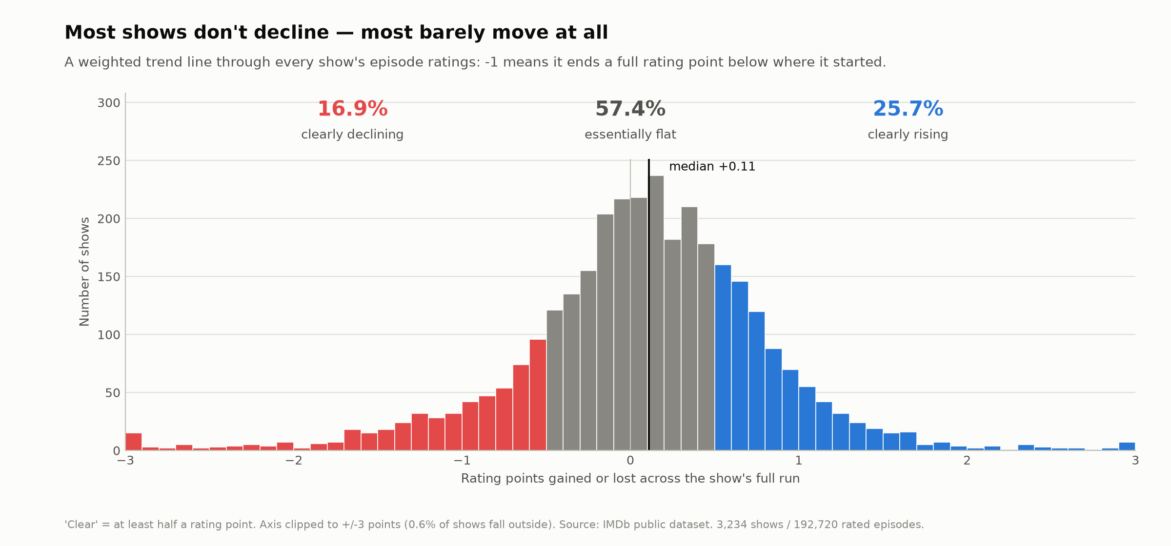
Decline is real, it just isn't where the belief puts it: in shows that ran too long, in shows that are simply old, and in the handful famous enough for everyone to have an opinion about. That last one is the interesting part. The belief isn't wrong so much as drawn from a different sample — the one nobody picked at random.
Read the essay → · Technical report · Decision log · Code and data
My first strong result was a −0.37 correlation saying the highest-rated shows decline hardest. It was an artifact — I had correlated each show's trend against its own starting point, and one estimate feeding both sides of a comparison invents a relationship. Compared against a separately measured second half instead, the strongest starters gave up 0.07 of a rating point.
Two rules I had written down in prose — never put these two colours in one
chart, never derive a share as 100 - other — I went on to break both myself,
in code, inside the same project. They are tests now.
Every document in the project glossed "16.9%" as fewer than one in six. One sixth is 16.67%, so the share was just above it, not below. The number had been right all along; the sentence carrying it to readers had not, and that was the part people would actually repeat.
All three are written up in the decision log, alongside the ones I caught before they mattered.
Python · pandas · NumPy · matplotlib · pytest
Open to data internships — sahar25@itu.edu.tr